Why Graphic Design for Your Business Needs to be a Priority

Graphic design is a visual communication medium. It allows creatives to convey their message to the public and enables creatives to show off their skills. Lastly, it provides businesses marketing assets and branding identities.
Graphic designers have a way of creating their designs or visual assets to make it seem like it has different meanings to many. And that’s what makes graphic design interesting. It can be something subtle in logos or explicit in ads.
Meaning is important in graphic design. After all, graphic design communicates with the audience. The thing about meaning is that graphic designers can interpret it as one thing, but a graphic designer another. That’s one way people see graphic design differently.
So, in this article, we discuss the basics of graphic design and why people perceive graphic design in different ways.
What is Graphic Design?
Graphic design is subjective. For those without experience, many would think it might be just art. Well, they’re not wrong. But graphic design delves into more than just art since it takes on different meanings when viewed.
Especially for professionals, the responses differ as well. To some, it helps brands to get recognized and identified through different marketing and advertising materials. Some others go for the conventional meaning which tries to put harmony into different elements and make it aesthetically pleasing.
For businesses, graphic design is a way to showcase their products and services visually and aesthetically to their customers. Without them knowing, graphic design is an integral part of their business in some form or another.
Types of Graphic Design
Possibly an obvious reason as to why people see graphic design differently is because it’s present in different media forms. Since businesses need to reach their target audience it’s important they use more than just logos, packaging, and marketing items to get noticed.
Here’s a list of some visual assets that most businesses request from graphic designers:
- Advertisements
- Social media graphics
- Packaging
- Branding
- Website design
- Annual reports
Graphic Design Examples:
Fortunately, graphic designers aren’t limited to just one medium in creating their visual assets. Big brands, in particular, hire design agencies for their design needs. Most of them would seek help from branding. It means they’ll ask for logos, fonts, and packaging designs among others.
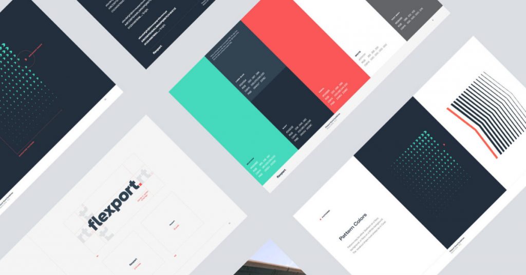
Check out this example from Firstborn, a graphic design agency. They developed the branding for this company called Flexport.
Colors are a huge part of the branding experience, so that plays a big role in their identity. In turn, all aspects of their company have their signature color on their apparel, materials, and website.
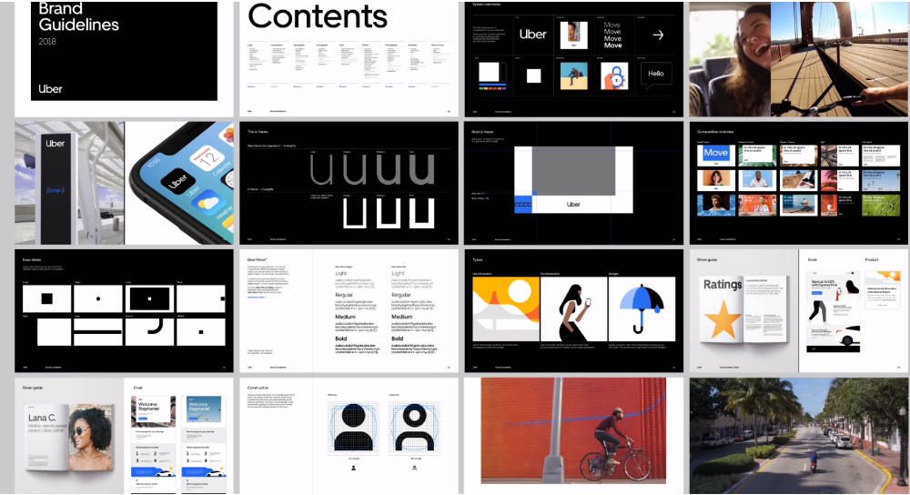
Here’s another example coming from Wolff Olins. They rebranded Uber and integrated Uber’s logo not only in their office, but in their transportation as well. Wolff Olins also provided advertising assets for the ride-hailing service too.
Since websites are important to create brand awareness, they can ask graphic designers to create illustrations, icons, or animations to spruce up their website.
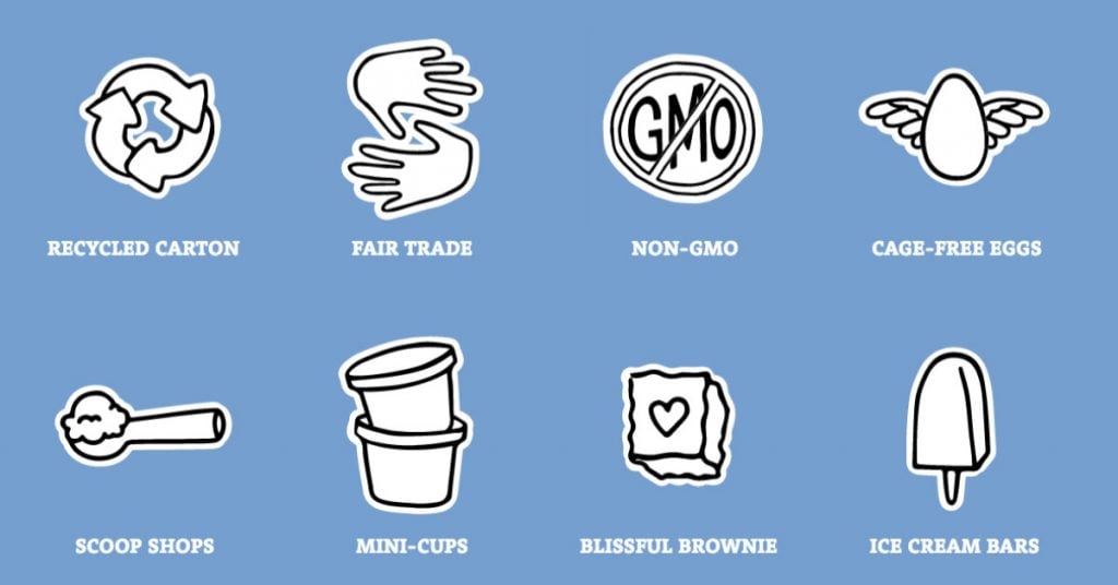
Check out how Happy Cog created custom icons for Ben & Jerry’s website. It’s a way to show how Ben & Jerry wants to promote themselves to the public. It looks casual and approachable as well.
To promote or market their products or services, brands can tap graphic designers to create advertisements or social media graphics as well.
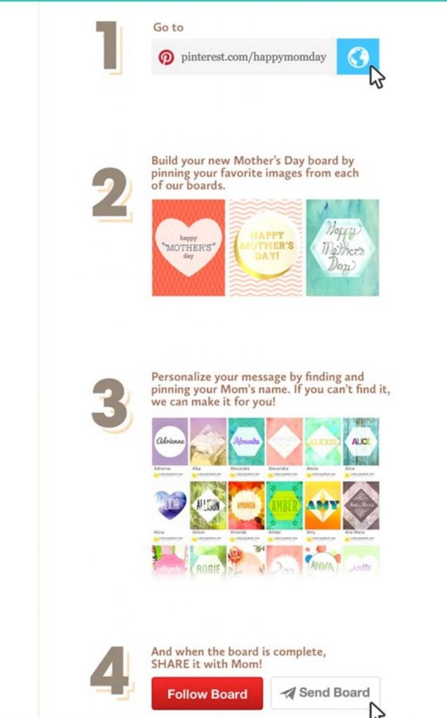
An example comes from the Honey Bunches of Oats campaign. It’s a Pinterest campaign by Manifest Digital where they created custom social media graphics for the company on Pinterest. It’s a great social media campaign because it allows users to share the graphics with others.
Elements and Psychology of Graphic Design
This is where graphic design gets deep. The concepts and elements in graphic design help shape the psychology in viewing a graphic design asset.
Most don’t realize there are many elements to graphic design. It’s not just about piecing together certain shapes or lines. It’s not also just about finding which color matches with this one and a font that matches with the graphic.
Graphic designers go deeper into meanings, as sometimes shapes and colors can elicit reactions. Messaging is an important factor in graphic design. Since some graphic designers may rely on the art or design only, it’s how they can relay meaning to people.
Gestalt Principles
One of the leading theories that graphic designers know is the Gestalt Principles. It’s how they’re able to create designs and subtly convey meaning.
According to User Testing, there are seven attributes in the Gestalt Principles:
- Similarity
- Proximity
- Closure
- Focal point
- Figure-ground
- Common region
- Continuity
Graphic designers apply these principles in their design, which allows them to create harmony in their visual assets. It’s how they sneak in ways the general public would analyze further if they choose to.
Logos are one example of how the Gestalt Principles work. Logos provide the fundamentals of a brand. Not many know that there is a context in design.

Here are some well-known examples of logos that integrate a Gestalt principle:
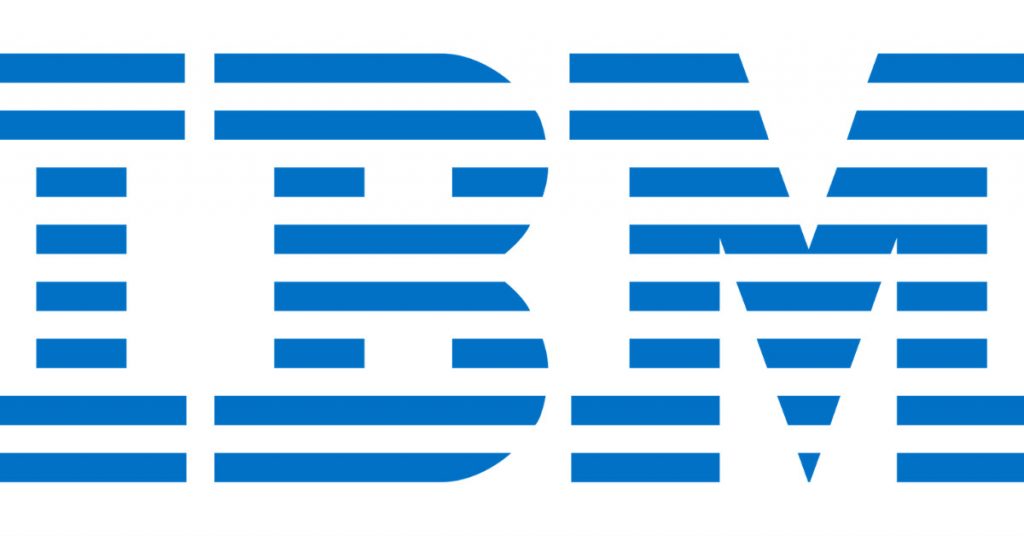
- IBM is one of the largely used examples of the proximity principle. Despite the horizontal bars, people can still recognize the IBM letters.
- The NBC logo represents similarity because of the wings in the peacock logo. It’s of the same size, but not color. Zillion Designs adds that closure is also present to help create the silhouette of completeness.
- Coca-Cola presents continuity and harmony. Plus, it doesn’t break the logo apart and tries to connect two elements together.
Restorff Effect
Another concept that contributes to the psychology of graphic design is the Von Restorff effect. Basically, it’s when a design has something that sticks out from among the crowd. According to Hubspot, that’s how some would get people’s attention.
That’s why in several ads or designs, you can see that there’s a certain object or shape that would always get your attention. It’s how you can attract customers into retaining something and remembering your brand for it.
Branding
In some cases where businesses ask graphic designers to create their brands and other design deliverables, graphic designers need to integrate branding. In every visual asset, graphic designers shouldn’t only consider the business’s interest at heart, but also the business’s target audience.
Since graphic design is visual communication, graphic designers may have the challenge of ensuring that at first glance. This way, the audience recognizes the brand. This is their signature style.
Take thought-provoking advertisements for example. They’re perceived as powerful or clever because of the imagery or messaging that graphic designers want to portray about a certain topic or issue.
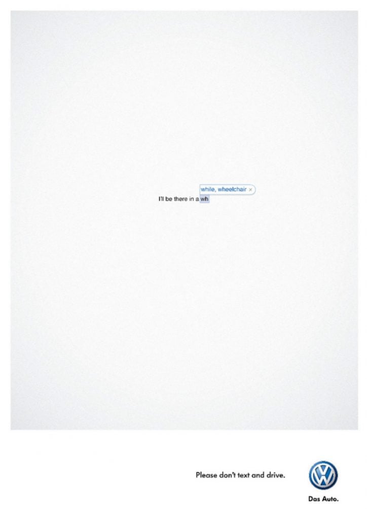
Some car advertisements would tell drivers to be more careful. They present it in clever ways like a text message, as Volkswagen did. It’s a clever advertisement because not only should a driver text while driving, but the copy also says that they’re on their way. The autocorrect is showing on the way or a wheelchair, which could be a result of an accident.
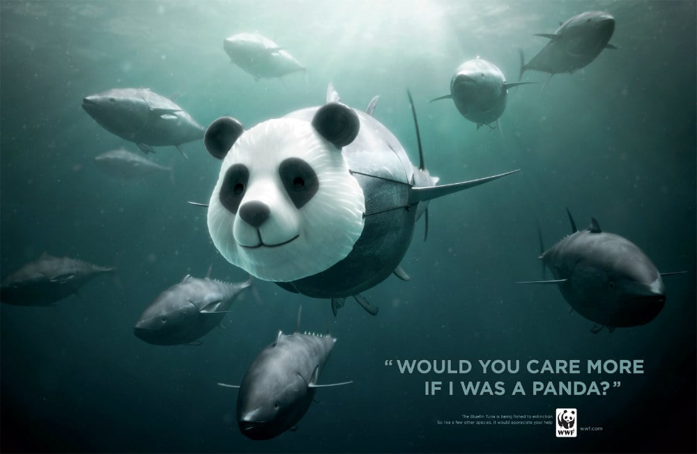
Another one comes from WWF, wherein a panda is swimming in the ocean, which was photoshopped into a shark. WWF is sending a message that if the shark was as cute as a panda, would people care more about them?
Color Psychology
Color psychology is another factor. With color, you’re able to elicit certain emotions like happiness, calm, or envy. That’s why some brands have distinct colors because in that way you want to associate that color with a brand.
The Logo Company provided an infographic as to how colors are interpreted. Red signifies excitement and youthfulness. Blue provides security and trust. Yellow makes us warm or optimistic. Green provides health or growth.
Example brands and colors:
- Coca-Cola: Red
- American Express: Blue
- National Geographic: Yellow
- Android: Green
As mentioned, shapes also contribute to the way you see a certain logo or design. In an infographic by Visme, they associate shapes with feelings like harmony for circles or order for squares.
Differences in Graphic Design
One of the best things about graphic design is that almost every output is different. It would be boring if graphic designers followed one design or used the same colors and elements in every design. That’s why many would see graphic design differently because of the training, experience, and taste of each graphic designer.
While many graphic designers follow the preferences of a brand or business, graphic designers tend to have their signature style integrated into the design.
The Content Marketing Institute discussed the importance of having visual branding by interviewing designers. According to Paul Biedermann, personal visual branding can allow companies to recognize the graphic designer’s work. In turn, the designer puts some of his branding in the design.
Key Takeaways
Graphic design takes on many forms for businesses. Graphic designers create advertisements, packaging and marketing assets, and branding identities for brands.
Likewise, graphic designers not only show off their talents in design, but they communicate meaning in the subtlest of ways. Many factors go into the design and that’s what makes it intriguing because one element can change the way a design looks and its overall meaning.
Penji can level up your startup or company’s branding or marketing. As an unlimited graphic design service, Penji can provide you all the high-quality visual assets you need. Just tap on the demo button and you can be well on your way to unique and high-quality graphic designs.


