6 Tradeshow Booth Hacks To Make You Stand Out
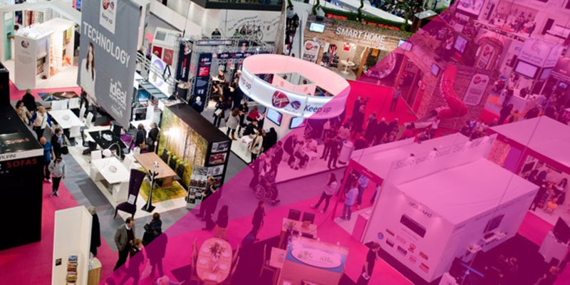
If you’ve ever attended a trade show, you know how competitive it can be. Everyone has the same space, and they can place anything they can fit into the small area. All the booths there are considered your competition, even businesses from different industries than you. You need the professional graphics to make it work, and without it, you won’t get too far. But else how do you make sure you’re the stand-out booth of the year? Follow these six tips, and your trade show booth design will be the most memorable thing they’ll ever see.
1. Limit colors and graphics
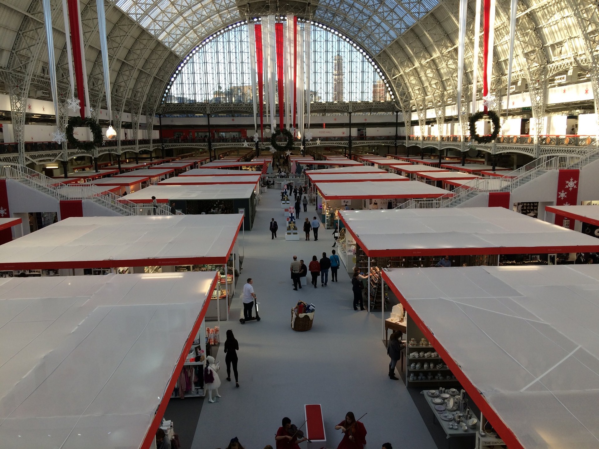
A trade booth attracts attention, but don’t cover every surface with pictures and colors. You need to strategically place the designs to have attendees understand your purpose. Good graphics bring in people to your trade show booth. One of the first things people at a trade show will judge you and your business for is how well designed your booth is. Conventions will see dozens, if not hundreds of booths, during an event. It’s important to be noticed, but for the right reason.
A graphic designer can help your business create effective designs with a few colors and images. They can match shades with each other to ensure the colors make consumers feel a certain way. Cool-toned colors can create a calming feeling, while warm-toned colors create excitement. Both have benefits and disadvantages to using them, but the colors should match. Clashing colors is a fast way to becoming forgotten at any trade show.
An image needs the same care as colors do when selected. It should invoke the feeling you want your consumers to take away. Do you want them to leave smiling from your booth? Show pictures of people enjoying your product. Maybe you want them to ask you questions about your business and promote this by showing images of people in the work environment. One way to know if your booth is effective is by stepping away from your idea and looking at it from the consumer’s perspective. If it feels oversimplified to you, it’s just right to attendees. Event marketing designs are great when they’re done in a way that’s balanced for you and your consumers.
2. Good copy
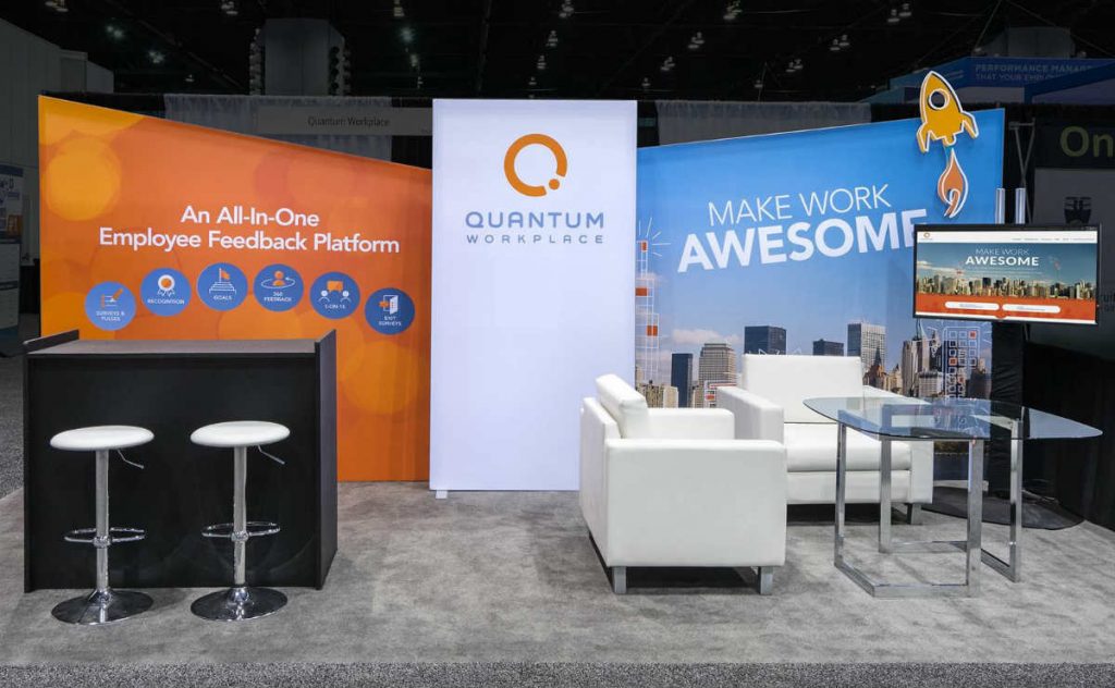
Effective copy is a necessary part of any trade booth. Some businesses will only include their name and logo multiple times, without extra copy. This might attract some people, but it won’t work for everyone. Skeptics may find themselves deterred from engaging with your booth because they don’t understand what you’re selling. A booth is another form of advertising, and most marketing needs good writing to truly work. Advertising and graphic design are different, but the lines can blur at trade show events.
This copy doesn’t need to be complicated. It should be straight and to the point. Adding your slogan to designs is one way to execute this. Based on how effective your slogan already is, this may be all you need. Your slogan is one way for consumers to know who you are and what you represent. Not everyone is a visual person and takes in design as the message. They might need great design and effective copy to fully understand what it is you’re trying to sell.
3. Make it tall
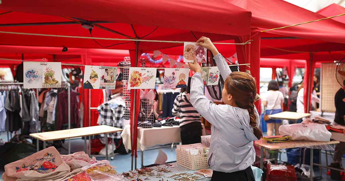
You’re more often than not provided a limit to how wide your space is, but there might not be a restriction on height. Before planning a tall structure, ensure you know the guidelines of the event. If there is no restriction, or if the limit is fairly high, take full advantage of adding height. Your business is not the only one there to bring in customers. Even if the organization next to your booth isn’t in the same industry, they’re still your competition. Based on proximity, you and your neighbors want to bring in customers. Adding height is an easy way to stand above the competition.
Your booth doesn’t have to be giant. Although, adding height can make it easier for attendees to see your booth from across the room. If you have a sign hanging fifteen feet off the ground, it’s more than what your neighbor could have. The height added should have a purpose. Without a purpose, it’s an only decoration that doesn’t do anything to help you. You need proper trade show materials to make the difference. Remember, a tall booth isn’t enough.
4. Add Textures
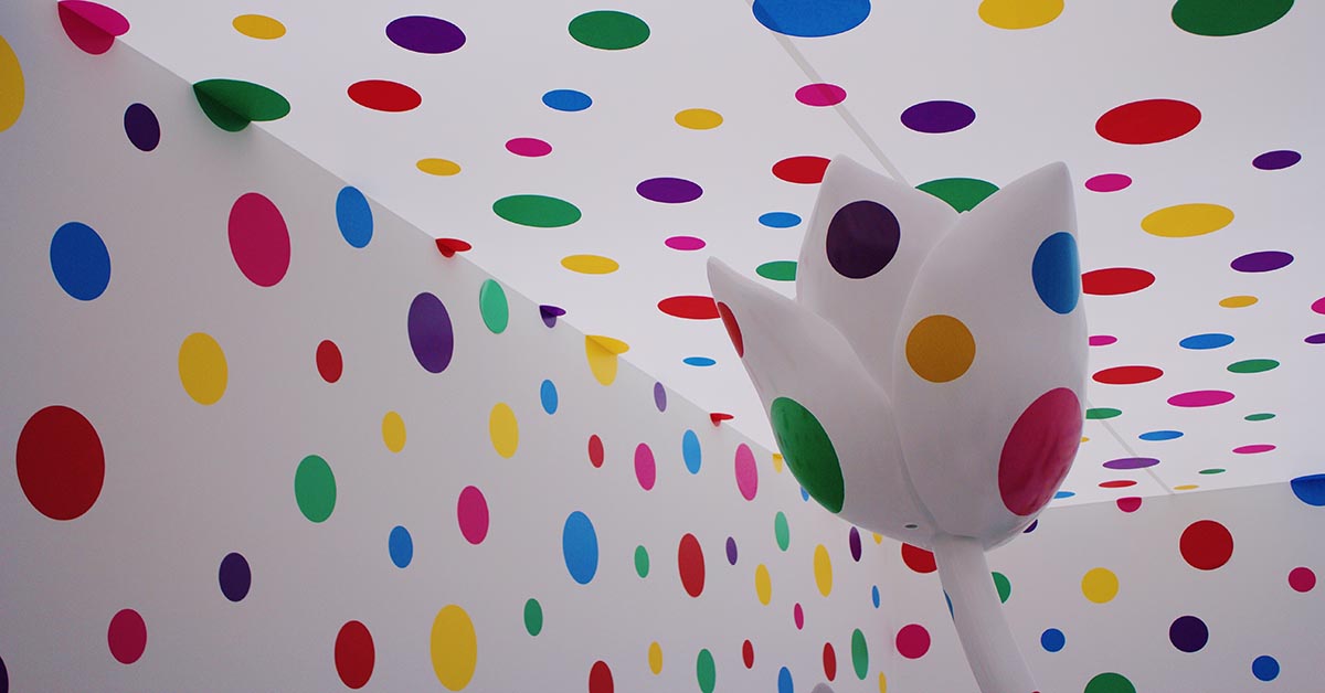
Adding texture to your booth can help it stand out more than any other design at an event. There are a wide variety of ways to include textures by breaking down what it is you’re promoting. Does your product physically have anything unique about it on the surface? If so, adding the feeling somewhere on your booth can change how participants experience your booth. In case you offer a service or a product with no texture, think about how it could feel. There are opportunities to not just make it look like it has a texture, but to give it the feeling as such.
In this case, you can use outrageous patterns like the spotted one above. It draws your attention and is unique compared to other booths. Most booths won’t want to experiment with weird patterns like that, but find the one that works for you. For example, Lionsgate used a brick surface helped promote the company’s film. The brick itself supports Lionsgate’s promotion by adding a dystopian feeling. The graphic designs on the booth also provide this experience. However, the brick is what most people see first. Since it’s attached to most of the free-standing structure, it’s hard to miss. That’s why you want to go for a pattern that’s ideal for your situation.
5. Make it Interactive
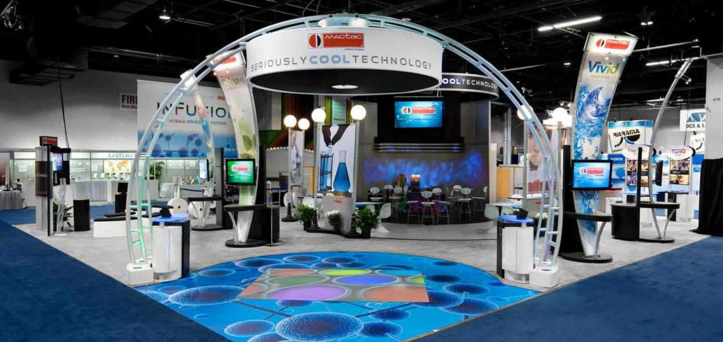
Once you get the foundation of your booth established, consider what else is possible. Your product likely has a niche or something unusual associated with it. This interesting factor can bring in people if they don’t resonate with your design. It’s another opportunity to pull in people who miss the purpose of your booth’s design. It’s a different type of design: it’s interactive.
Interactive design requires a separate plan from graphic design. The two still work together to provide an experience. Both must bring to life what the business stands for without needing to explain it.
This doesn’t mean it has to be interactional from start to finish, but it should have something consumers can take away from it. For many companies, this means giving out office supplies such as pens, pencils, folders and more. This is to make people feel like they gained something from visiting your booth. While this might be the simplest method, it doesn’t mean it’s the best. Once you find what works for your booth, you’re above the competition.
6. Be Personable

At the end of the day, you could have the best looking trade show booth design in the convention. But if you don’t have the right people presenting your business, people will walk right past you. Make sure your personality shines through and matches the tone of your booth. If you have a silly design, get silly! It’s okay to be outside the box and exaggerate your personality to bring in skeptical consumers. After all, if they have a bad experience at your booth, they likely won’t go to you again.


