10 Online Retailers Reveal Their Secrets To Conversion
Clamoring for attention from online shoppers is one of the main goals of an online retailer. And once they achieve this goal, the objective of getting customers to purchase from their online store comes next. The only way to accomplish both is through outstanding graphic design.
The top online retailer in the business focuses on even the subtlest design element to put its online store into the limelight. In this article, we’ve curated the top online retailers and the lessons you can learn in terms of graphic design.
1. Clear-Cut Design
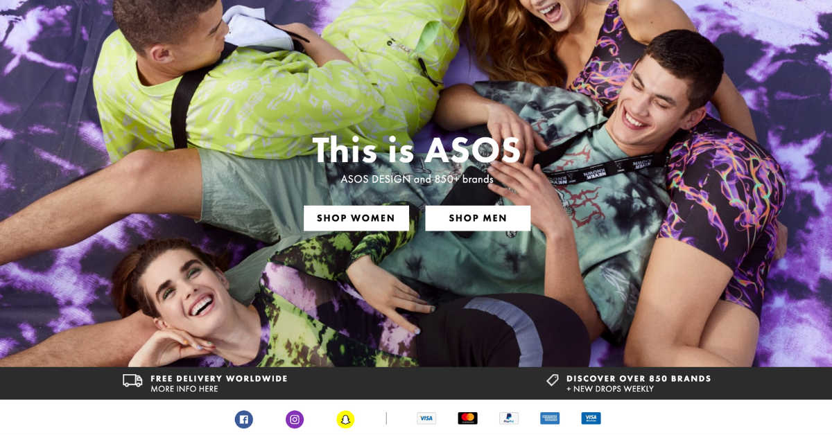
A confused shopper will never convert. When it comes to online shopping, not everyone has the dexterity to navigate through the entire site. It’s essential that you create a clear-cut design with a no-nonsense approach.
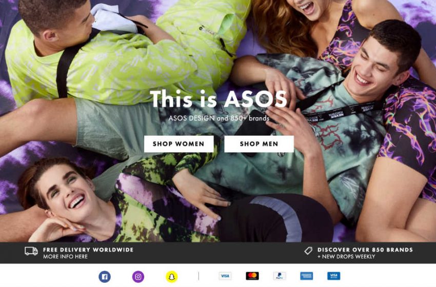
The best example is ASOS’ homepage. It has beautiful color palettes that get you hooked. Call-to-action buttons for men and women that lead you to where you want to go right away and the social icons and payment methods at the bottom. What more can you ask from an online store?
2. Fun Animation
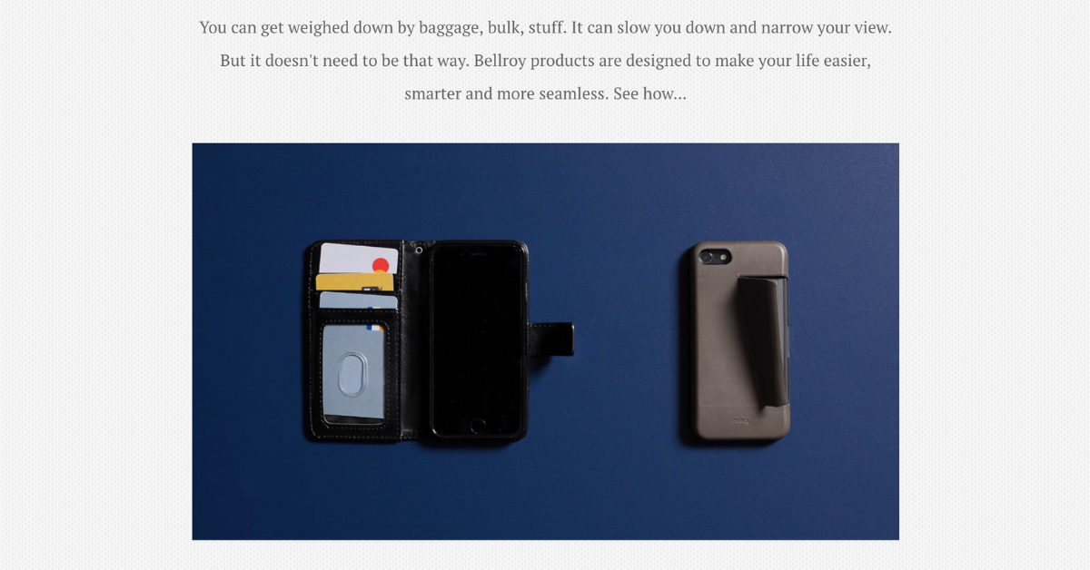
The top online retailer website comprises a variety of media. Images, videos, GIFs, and fun animations are a great way to make the shopping experience more creative and one-of-a-kind as opposed to just scrolling through a bunch of still shots.
Bellroy follows a conventional design with a very simple layout that makes the entirety stylish and tasteful. They also presented some of their featured products in a fun animation on the main page.
3. Smart Use Of Colors
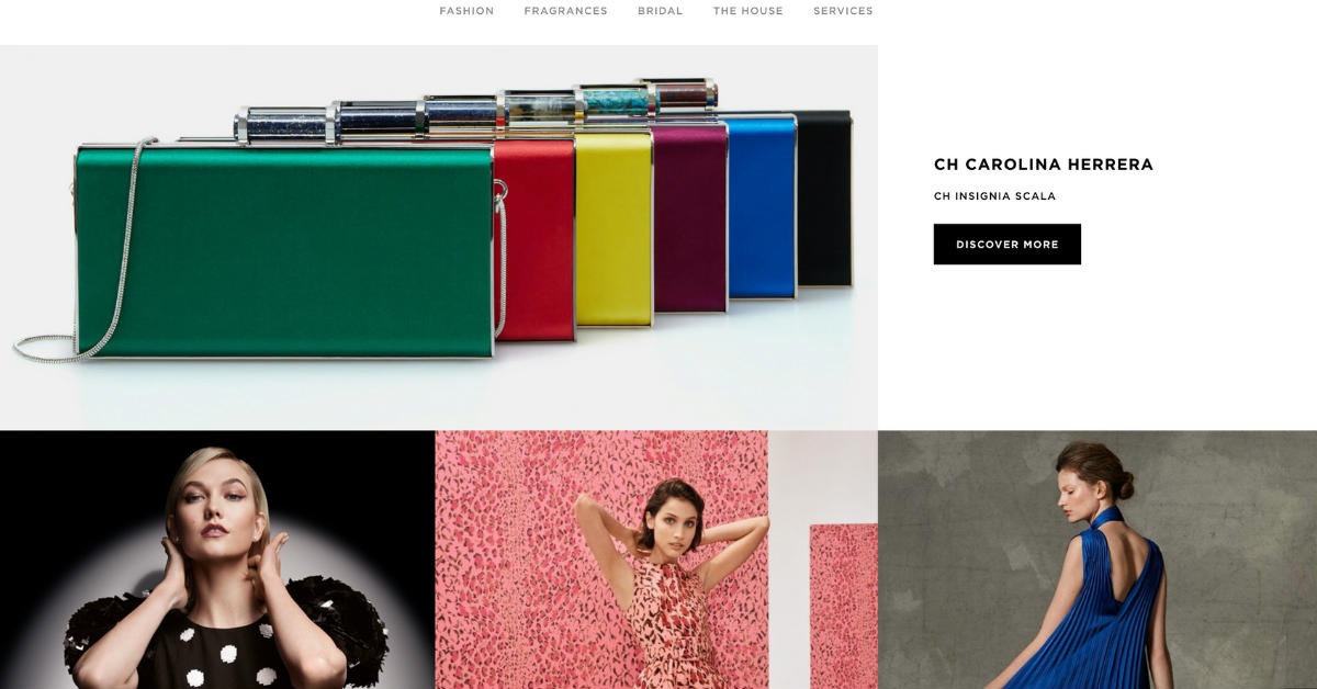
Colors subliminally impact a buyer’s decision. The smart use of colors in graphic design undoubtedly influence your mood, style, visuals, and overall emotion. That’s what we call color psychology in marketing.
Carolina Herrera makes their products pop by utilizing bright and stunning color palettes on a white background.
4. Slideshows or Carousels

Carousels are perfect when you want to display several pieces of content in a coveted space — the top of your homepage, for example. This usually occupies a substantial area, contains very few texts in every frame, may include the brand’s mission and featured products and promotions.
We love the oversized carousel or slideshow from X-Doria’s homepage. You get to learn features plus the benefits of their products at a glance.
5. Detailed Descriptions
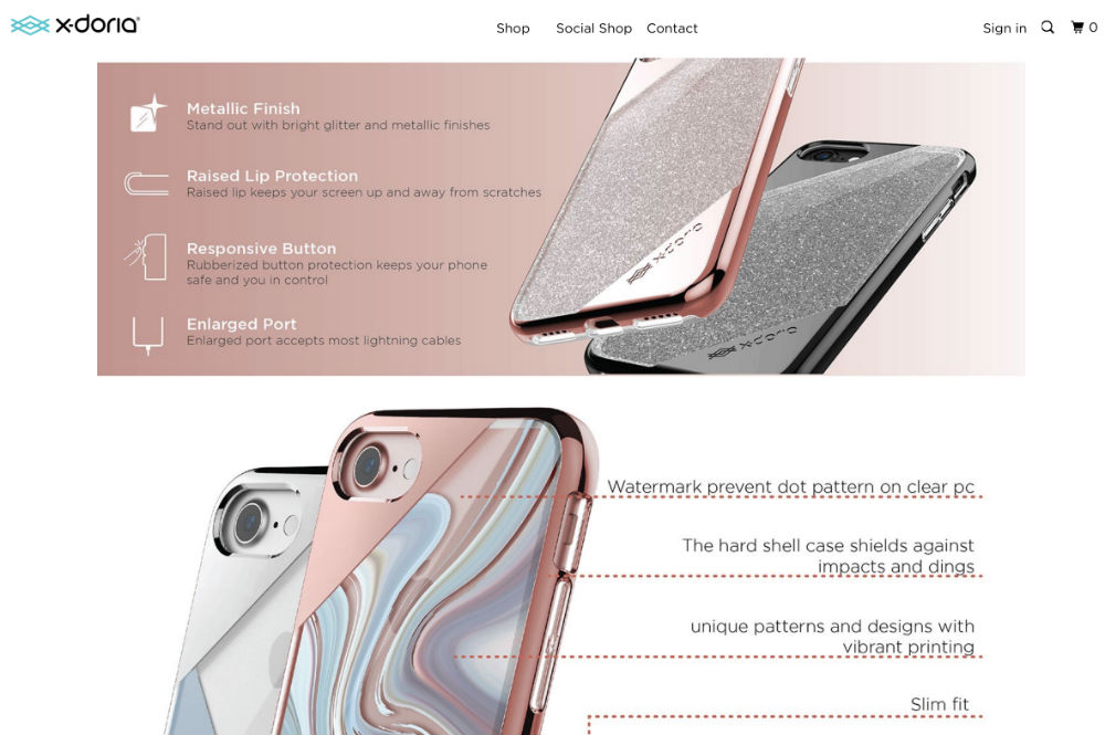
Needless to say, the top online retailers consider high-quality images as one of their core values. They also don’t skimp on their graphic designs. By hiring graphic design services that go beyond serviceability, you can be sure you’re gaining more than what you’re paying for.
Detailed descriptions should accompany high-quality images. That is the lifeblood of an online store. Customers don’t want to deal with the guesswork, let alone deal with customer support for a simple query like size or color. They want a convenient and uninterrupted shopping experience. X-Doria did a great job giving customers high-quality visuals together with accurate, descriptive information.
6. Creative Videos
Videos are entertaining. They’re short and an easy way to learn about a product in less than 30 seconds. Videos actually increase conversions and boost sales in the eCommerce industry when optimized correctly. This video from Man Crates is a distinct and entertaining way that conveys their branding while giving customers the lowdown on how to use their products.
7. Unique Typography
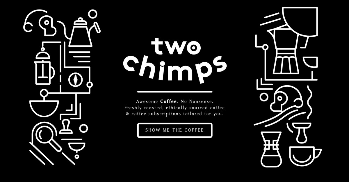
With millions of eCommerce stores worldwide, you don’t want yours to be another run-of-the-mill online store. You want to be the top online retailer there is — both in quality products and graphic design. Break the mold in terms of overall design and typography. Two Chimps Coffee’s homepage has neat doodle-like lines and shapes in striking black-and-white contrast. The typography is also unique, which sticks out from the competition.
8. Various Interactive Product Images
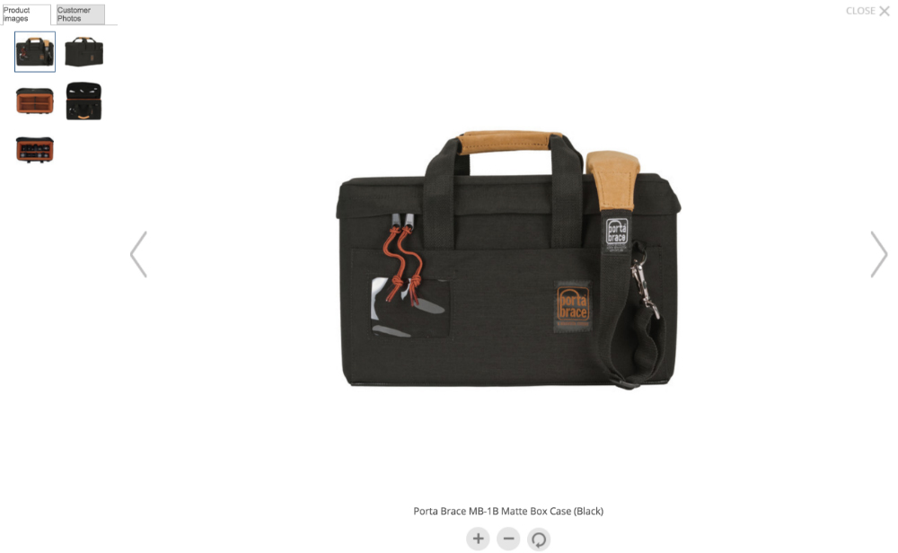
Customers want to be able to scrutinize the product from every angle. A single product image won’t fill the bill. As an online retailer, you want to take the guessing game from the customer’s shopping experience. Provide them with every view of the product such as top and bottom views, left and right views, back and front views, and views when opened or closed.
Allow customers to be able to rotate the products, zoom in and out with ease, and even a 360-degree option can really push for that sale. Also, update products when customers click on different sizes and colors.
B&H’s product page is a perfect example of interactive product images. They have an angle view, open view, show-in-use view, and even an example of an actual customer’s photo.
9. Minimalist Layout
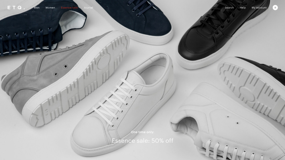
In the world of design, they say that less is more. Create a simple layout where it consists of fresh and modern elements that work well together. ETQ is one of the top online retailers in terms of simple and minimalist website design.
10. Responsive Design
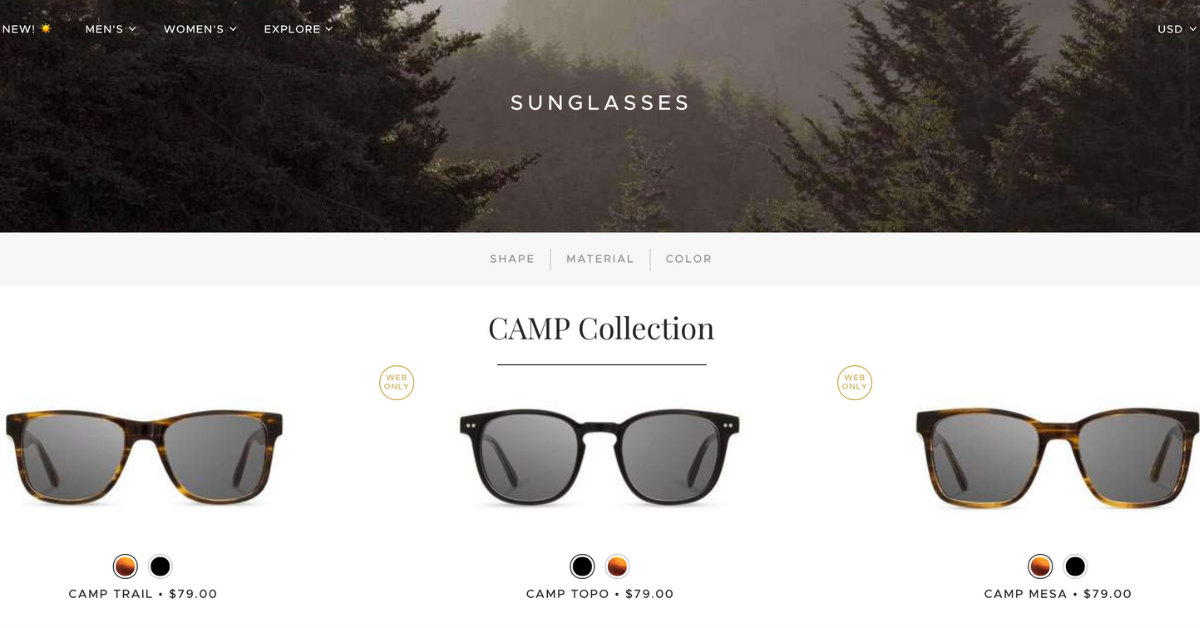
Responsive design not only makes for high customer retention, but it’s also a way to give customers an exciting and stimulating online shopping experience. Be creative when making your designs responsive. Shwood Shop’s product images move whenever you hover your mouse on each of them.
Wrap Up
If you want to be the top online retailer out there, think of how you want your customers to have an unrivaled shopping experience. By fusing these different design elements and utilizing effective call-to-action buttons, your online retail store could be featured in a list such as this one.


